The Death of Perception ( this will piss off some libs)
Politics • February 2008 • Views: 440
Here is a chart showing the number of deaths of military personnel by administration, Clinton V. Bush.
Here is a chart showing the number of deaths of military personnel by administration, Clinton V. Bush.
A very pretty chart that substantiates nothing. Where did this data come from? What is the explanation for the higher death rates under Clinton? Hey, I despise Bill Clinton and am very willing to believe almost anything negative I hear about him, but unless I’m missing something obvious to everyone else, this is really weak.
While it’s true there were more war deaths in the Clinton years than the GWB years (govt link: ) .. the Clinton number seems to be inflated in the chart that you linked to.
Le Patriot, a parenthesis got stuck on the end of your link. Here is a version that should work (warning: the link will cause you to download a .pdf).
There’s a list of U.S. active duty military deaths in Table 4, which is page 10 of the .pdf. Adding up the numbers, I get 7500 deaths in eight years of the Clinton administration, and 8792 deaths in the first six years of the Bush administration.
The table on the following page lists causes of death. If I lump together deaths due to hostile action and deaths due to terrorists attacks, and consider the sum to be war deaths, I get 76 deaths in the eight years of the Clinton administration, and 2651 deaths in the first six years of the Bush administration.
How did you compute more war deaths in the Clinton years than in the Bush years?
 Alone in a Bathroom: The Fear and Uncertainty of a Post-Roe Medication Abortion Angel tucked two white pills into each side of her mouth, bracing herself as they began to dissolve. Her deepest fears and anxieties took over. Angel had wanted to talk to a doctor before she took the pills to ...
 They Were Desperate to Get Pregnant. Then IVF Gave Them Extra Embryos. One morning last spring, Ashley Harrolle put her 1-year-old daughter down for a nap and went to the kitchen. She pulled up her fertility clinic’s contact information. It was time to make the call. In a freezer several hundred ...
 Joe Bacon ✅
 March FavoritesYou've seen these all already but looking back, just because. These are my favorite shots of this last month. That 1937 Zeiss Sonnar is such a gloriously wonderful bit of glass. Thanks for looking.
 Russia’s New Combat Robots Blown Up by Drones Near Avdiivka When we landed on the moon, I thought about how science fiction had become real. Now, the robot wars have begun. It's more poignant somehow on the ground than in the missile wars we have in the air as ...
 Why Did More Than 1,000 People Die After Police Subdued Them With Force That Isn’t Meant to Kill? An investigation led by The Associated Press has found that, over a decade, more than 1,000 people died after police subdued them through physical holds, stun guns, body blows and other force not intended to be lethal. More: Why ...KGxvi
 Abortions Outside Medical System Increased Sharply After Roe Fell, Study Finds The number of women using abortion pills to end their pregnancies on their own without the direct involvement of a U.S.-based medical provider rose sharply in the months after the Supreme Court eliminated a constitutional right to abortion, according ...
 Once Praised, the Settlement to Help Sickened BP Oil Spill Workers Leaves Most With Nearly Nothing When a deadly explosion destroyed BP’s Deepwater Horizon drilling rig in the Gulf of Mexico, 134 million gallons of crude erupted into the sea over the next three months — and tens of thousands of ordinary people were hired ...
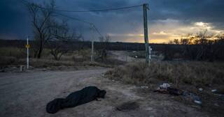 Texas County at Center of Border Fight Is Overwhelmed by Migrant Deaths EAGLE PASS, Tex. - The undertaker lighted a cigarette and held it between his latex-gloved fingers as he stood over the bloated body bag lying in the bed of his battered pickup truck. The woman had been fished out ...
