Why it’s time to panic: US Health Care Spending as a Percent of GDP
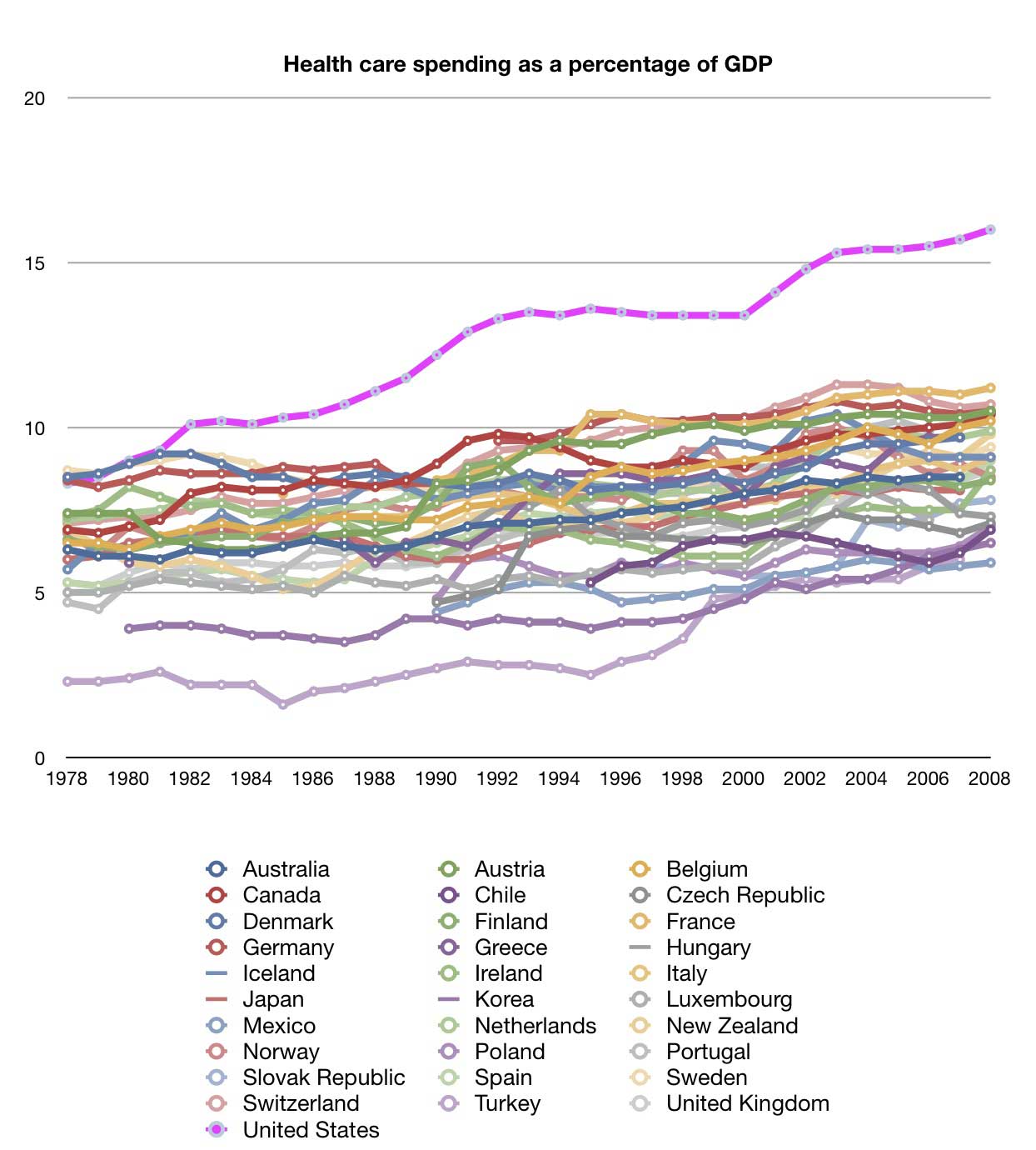 Can You Pick out the US line in this graph?
What you are looking at is spending on health care as a percentage of GDP going back 30 years. Lest you think I’m cherry picking, I’m showing you data from all 31 OECD countries. It’s not hard to pick out the US line, is it?
We should spend more money than other countries. We’re richer than them. But should we be spending so much more of our GDP on health care?