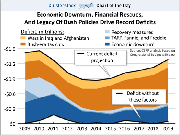
The Deficit You’re Freaking Out About Is Bush’s Fault
All we need to mostly fix the budet is two less wars and Reagan era tax rates.
Economy • August 2011 • Views: 1,215
CHART OF THE DAY: Reminder, The Deficit You’re Freaking Out About Is Bush’s Fault
 Keeping It Real