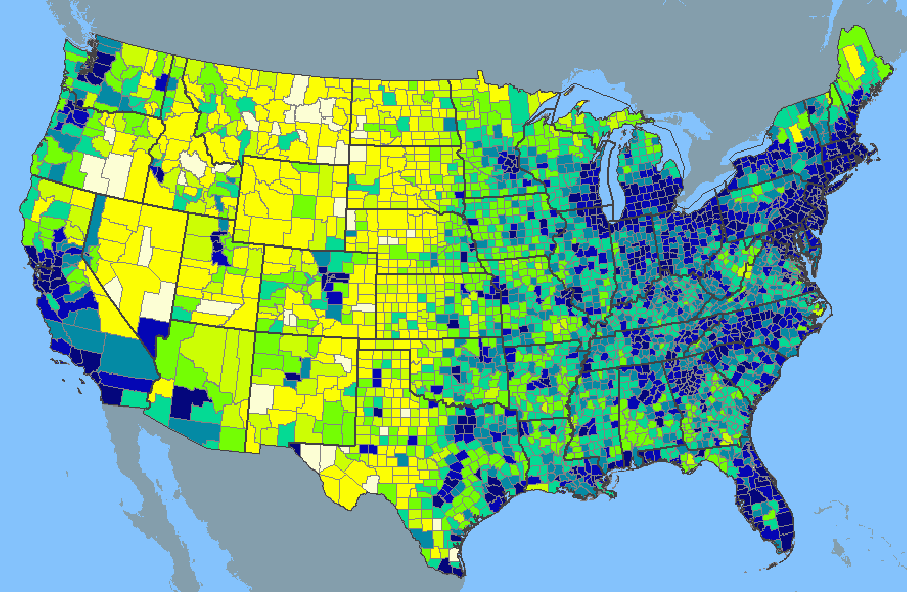
A Map of Hateful Tweets by Region
People Tweeted badly-
More: Hate Map
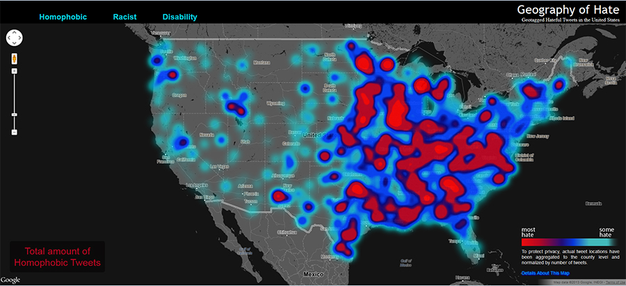
Geography of Hate
Geotagged Hateful Tweets in the United States
Homophobic
Racist
DisabilityTo protect privacy, actual tweet locations have been aggregated to the county level and normalized by number of tweets.
Details About This Map — click to closeThe Geography of Hate is part of a larger project by Dr. Monica Stephens of Humboldt State University (HSU) identifying the geographic origins of online hate speech. Undergraduate students Amelia Egle, Matthew Eiben and Miles Ross, worked to produce the data and this map as part of Dr. Stephens’ Advanced Cartography course at Humboldt State University.
The data behind this map is based on every geocoded tweet in the United States from June 2012 - April 2013 containing one of the ‘hate words’. This equated to over 150,000 tweets and was drawn from the DOLLY project based at the University of Kentucky. Because algorithmic sentiment analysis would automatically classify any tweet containing ‘hate words’ as “negative,” this project relied upon the HSU students to read the entirety of tweet and classify it as positive, neutral or negative based on a predefined rubric. Only those tweets that were identified by human readers as negative were used in this analysis.


