re: #180 Charles Johnson
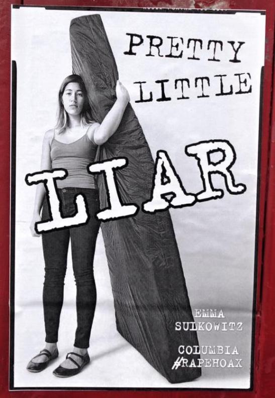
OK, here’s a better image of the Liar poster — and I’m even more certain now that it’s the exact same font.
All of the letters in common with the Brian Williams illustration are exactly identical. No doubt whatsoever.
I was looking at free fonts on the ‘net a bit. I am using the E as my quick identifier. It is very unique with the break in the upper extender. Plus the top of the E is thin and the bottom a bit heavier. It should be fairly easy to spot that E.
Problem is, there are a gazillion funky typewriter fonts. So, no luck, but I don’t have the time.
Oh yeah, I figure it has to be a free truetype font. Look who we are dealing with.
