Rep. Jason Chaffetz: Our Rotten Lying Anti-Choice Scumbag of the Day

I watched this absolutely disgraceful moment live this morning, as Rep. Jason Chaffetz tried to ambush Planned Parenthood president Cecile Richards with a bizarre “chart” that purported to show that Planned Parenthood had nearly ceased providing breast exams and cancer screenings, while the number of abortions radically increased.
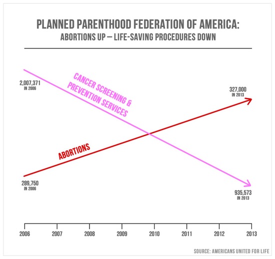
Here’s that “chart” — and I’m putting the word in quotes because it’s like a first grader’s idea of a “chart,” with just a couple of straight lines, one going up and one going down, and no Y axis.
But more importantly, watch as Rep. Chaffetz lies outright and says, “I pulled those numbers directly out of your corporate reports.”
No, he did not. The chart was created by Americans United for Life, a radical anti-choice organization, and it’s not just laughably over-simplified, it’s deliberately deceptive. Like so much of the propaganda these people circulate.
When Cecile Richards points this out to Chaffetz, he doesn’t apologize for lying, of course. He just moves on with a smile.
This is why Rep. Jason Chaffetz is LGF’s rotten lying scumbag of the day. (No disrespect intended to bags of scum.)
And by the way, here’s a clear image of that “chart.” Notice that 1) it starts in 2006, and 2) the numbers are ridiculously out of whack because the chart lacks a Y axis. “Cancer screening and prevention services” actually have declined while abortions have increased; cancer screenings end up at more than 935,000, while the number of abortions ends at 327,000. But the chart is presented in a deceptive way to make it look like there are now three times as many abortions as cancer screenings, which is ludicrously false. The truth is exactly the opposite.
At Mother Jones, Kevin Drum replotted the data for this chart, but added a Y axis. (Which is normally considered necessary when charting data, but apparently anti-choice propaganda organizations give themselves an exemption.)

And if you add in the other services Planned Parenthood provides, specifically STD screening and contraception, the chart looks even more real.

Here’s another look at the data from @NeotericLefty on Twitter:
@Green_Footballs its not hard to create an ACCURATE chart, @jasoninthehouse. Took me ~20 mins. pic.twitter.com/fnp0EpeyYN
— Neoteric Lefty (@NeotericLefty) September 30, 2015